How to create a chart with DataWrapper
Go to Datawrapper and sign in with your own profile. If you don't have a profile, you can create one on the right side of the page. To create a new chart press on the '+ New Chart' button. Upload you…
- Go to Datawrapper and sign in with your own profile.
If you don't have a profile, you can create one on the right side of the page.
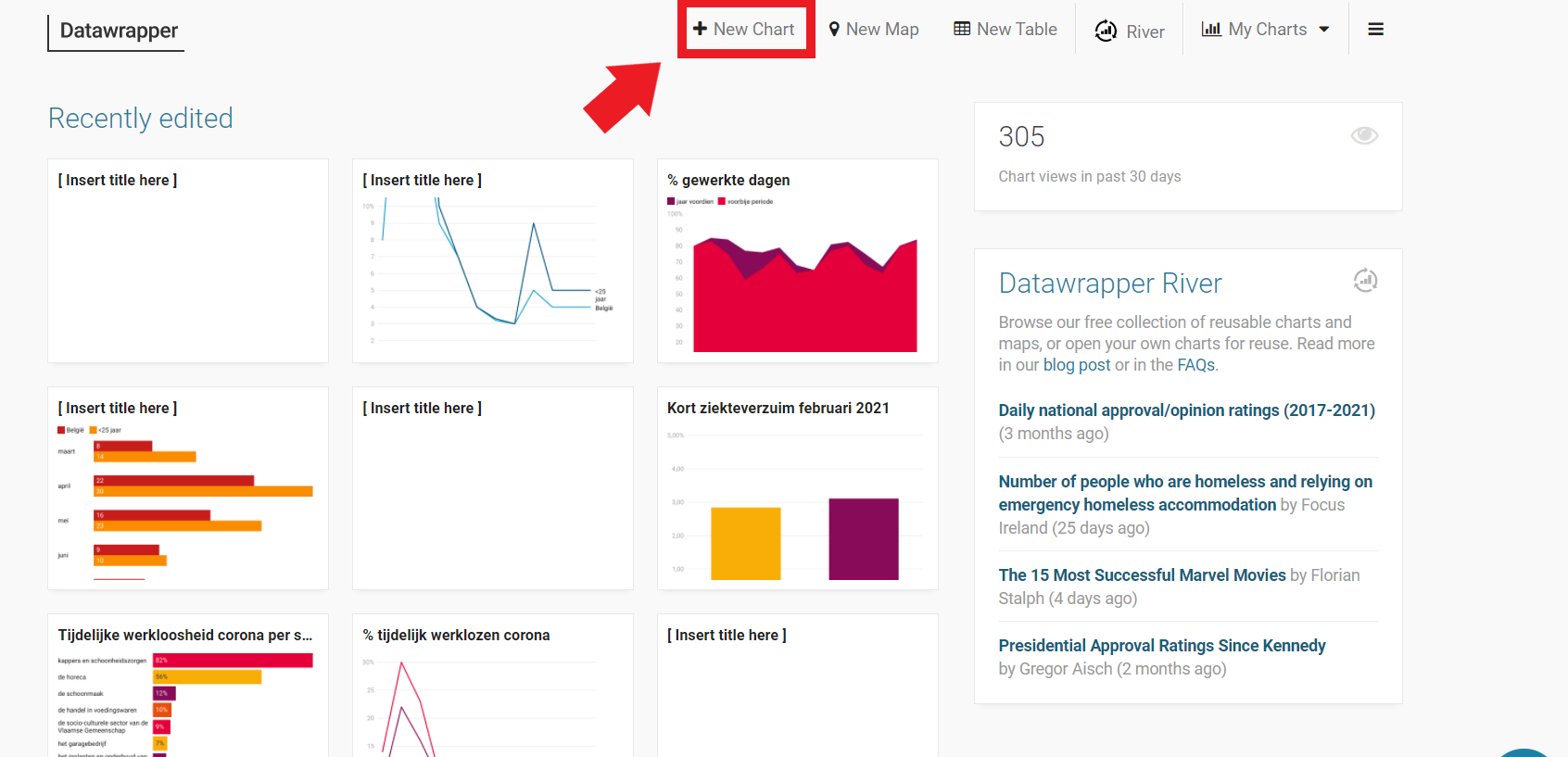
- To create a new chart press on the '+ New Chart' button.
- Upload your data by copy and pasting the desired dataset, uploading an Excell/CSV file or inserting a Google Spreadsheet.
The easiest way to do this is by selecting and copying only the desired rows/columns from an excell file and pasting it in the required field on the Datawrapper site. (you can select multiple rows/columns at the same time in Excell with the CTRL-button)
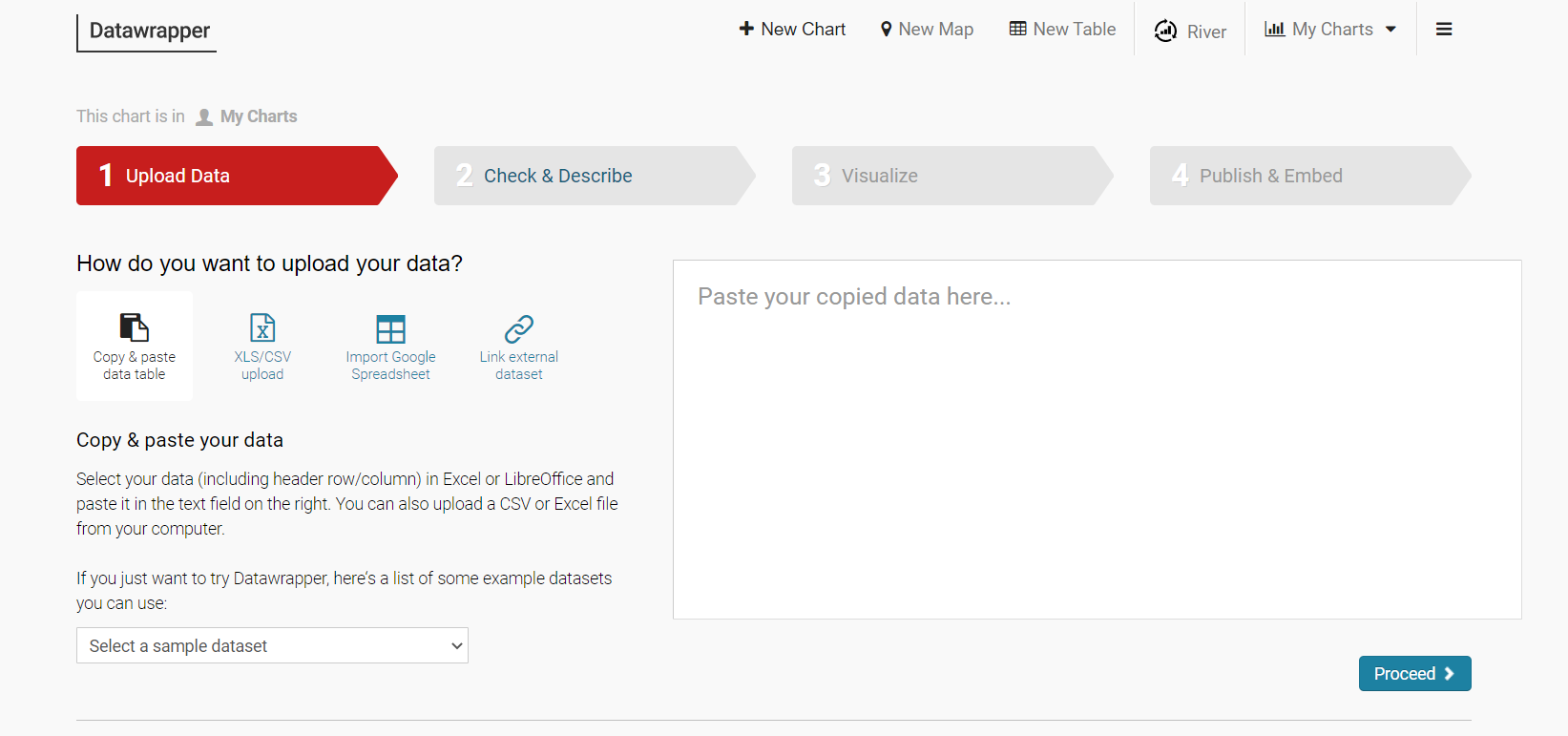
- Once you've added the data you can click on Proceed:
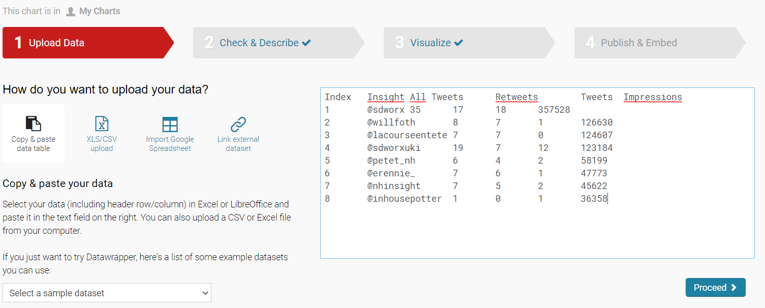
- Now you can check the inserted data and make changes if necessary. You can change the names of the columns, swap the horizontal and vertical data with the arrows in the right corner of the dataset, by clicking on the column headers a menu will open to change the properties/settings for a specific column/row...
It's also recommended to change the language of your dataset to the desired language settings.
If you added a dataset with more than 2 rows, like I did in the example, you can select the rows you don't want to use, and hide them from the visualization. See the video as an example.
- Select the type of chart you would like to use. Click Proceed when you're happy with your choice.
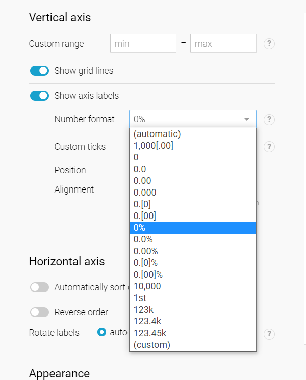
- In the refine tab you can now add a custom range, or make other changes to the chart. It's recommended to pick the right number format in the dropdown menu, for both the axes.
- Still on the refine tab, on the bottom you can see 'appearance'. Here you can change the colours from the chart by adding the color codes you can find in our brand guide. You can pick one color for the chart or customize them, depending on the data in your graphic.
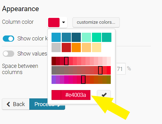
To customize the different colors, click the 'customize colors' button, select the desired element and paste the color code in the required field.
- Under the colors you can choose wether to show or hide the values of the chart.
If your chart contains absolute values make sure to hide them!
- Click Proceed
- Under the Annotate tab, you can add a Title, Data source, Byline,... for your chart. Click proceed after you filled in the necessary fields.
- Now you've reached the Layout tab, here you can make sure you picked the right language.
Make sure to disable the Data Download (otherwise people will be able to download the files you uploaded for your chart)
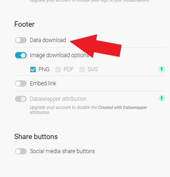
- Set the other settings to your preference and click proceed.
- Publish the chart by clicking the publish button
- Now copy the embed code, make sure that the responsive iframe option is selected.
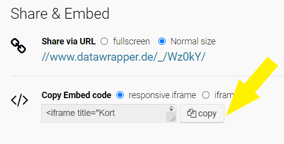
- Once you've copied the code, go to the desired page (article) in the Sitecore content editor. Go to the description of your article and open the editor by clicking 'show editor'.
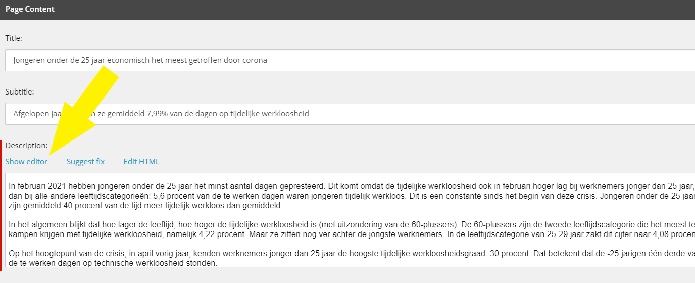
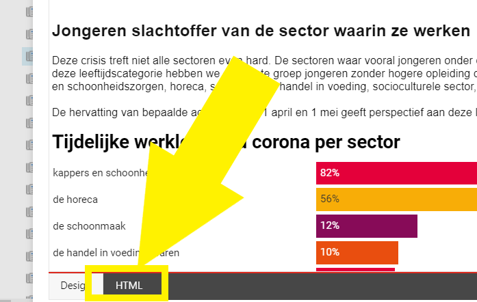
- In the content editor, open the HTML-tab
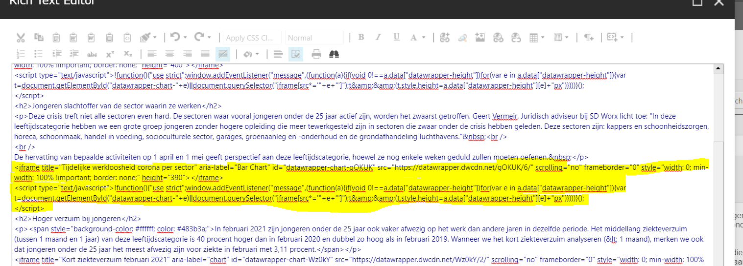
- Paste the code in the place you would like the chart to appear. Make sure you past it behind a </p> tag. The highlighted part in the picture is the code of my chart (iframe+script).
- Under the design tab, you can check whether your chart is visible. If it's the case, accept the changes and your article is ready to be published!
How did we do?
