Step 4b: Completing the email
Training Email Step 1: The basics Step 2: Navigating through Pardot, Folders and Campaigns Step 3: Creating lists Step 4: Creating an email Step 4b: Completing the email Step 5: Sending the email Our…

Training Email | |||||
Step 4b: Completing the email |
Our templates are foreseen with multiple components and blocks for you to utilize. We explain in this documentation how you utilize the blocks and what types of blocks there are.
How to utilize them?
- Editable blocks
- Repeatable blocks
Types of blocks
- Header
- Text block
- Images
- Buttons
How to utilize the blocks
Editable blocks
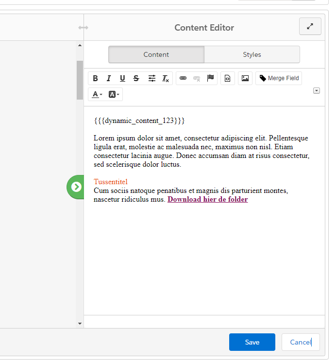
Every item within Pardot marked editable will have a grey striped line around the region that shows its changeability.

Items with this line are clickable and will pop open a Content editor screen at the right.
Repeatable blocks
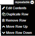
Repeatable blocks provide a way to switch components by moving them up and down, duplicating a block and using it somewhere else (like a CTA), or removing a row.
Watch out! Removing the original block will make it permanently disappear. You can always go back to specific versions in history when you make a mistake.

Types of blocks
Image blocks
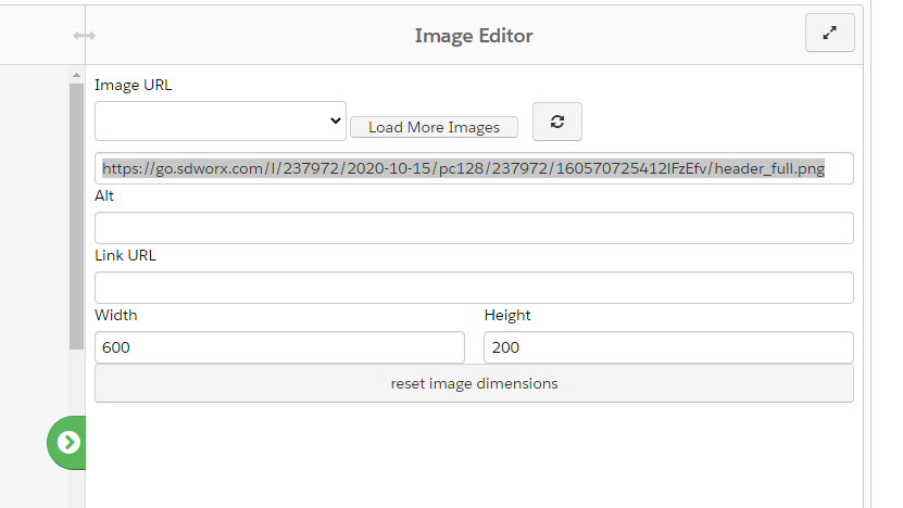
Each image that has a grey dotted line around it that indicates its editable. You can just click on the image and the image editor will appear to make the modifications.
If you have a new image that you want to utilize. Upload the image first. Explained via this article: Uploading files & images in Pardot.
Image URL: Replace the link in the highlighted area with the new link to add the new image.
Alt (optional): Alt stands for alternative, when an image doesn't load. You can describe the image via text. The alt text will be displayed instead of image. If the sender is new to the receiver, images are automaticly blocked from downloading. This can help to describe the content of the image. Optional to foresee, but highly recommended.
Link URL: When an image needs to redirect the receiver to a landing page or another piece of content. You can place it in this area.
Width + Height : This is to adjust the width & height of the image itself. Try to respect the bounderies of the image itself and/or the aspect ratio. Stretching the image only in height or width will come over as unprofessional imagery.
"Reset image dimensions": resets the width and height of the image to its original state.
Header image
Example email headers: SD Worx | Email headers
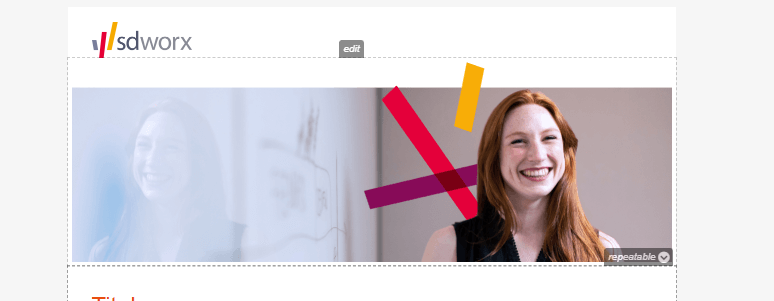
Email template: Full header
Templates named with full header will display a image above the fold that spans the full width of the email. This header image can only be a maximum of 600px width and a height is between 200px - 300px. Try to foresee some whitespace on the image itself at the top (roughly around 20px) so it doesn't hug the SD Worx Logo.
Email template: 2 columns header
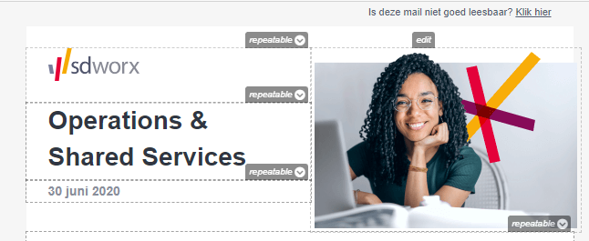
Templates named with 2 columns will display a logo, title, subtitle, and an image above the fold that spans the half-width of the email. This header image can only be a maximum of 288px width and a height between 200px - 250px.
Text blocks
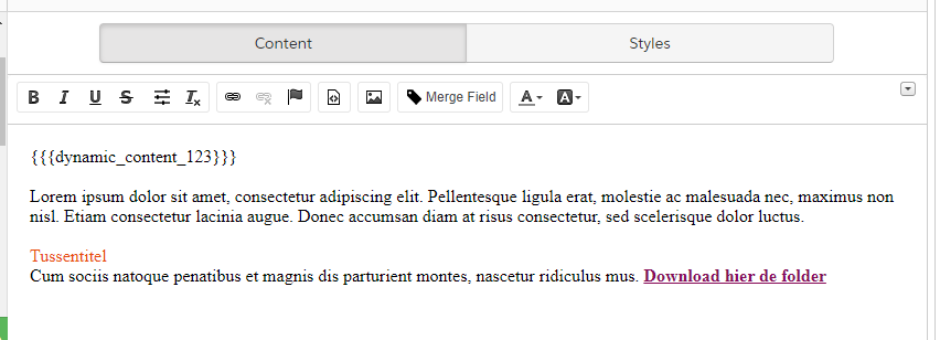
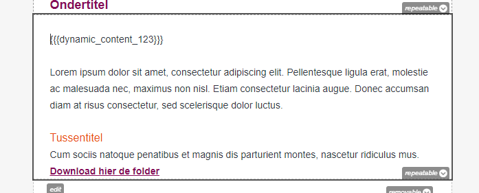
When clicking on a text block, it will open a content editor at the right of your screen. It will provide a full text editor where you can fill out your copy.
- All styling, coloring and size of the text are foreseen.
- You want to change the colors of a title or highlight a text? (Click on the icon mentioned below.) This will allow you to choose a color. The color codes are to be found on our design portal: Colours · SD Worx (zeroheight.com).

Example Text blocks

Buttons
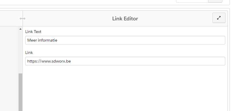
When clicking on the button that you want to edit, will prompt open the link editor to make your modifications.
Link text: is the wording of the button.
Link: The link where the receiver needs to be pointed to.
Do not forget to add UTM tracking as well. Explained in this article: Guidelines to use UTM parameters.
How did we do?
Step 4: Creating an email
Step 5: Sending the email
